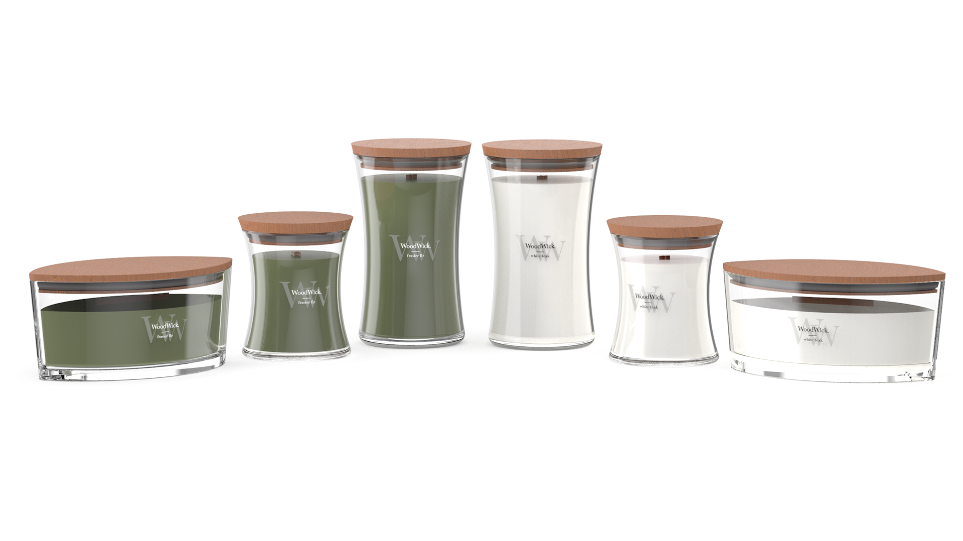
Faced with the task of refreshing WoodWick®’s label design working with fellow graphic designers and brand managers to reimagine the product’s visual identity. The challenge was clear: evolve the aesthetic, honor the brand’s sensory heritage, and navigate rigid packaging limitations imposed by the hourglass shape and existing production parameters.
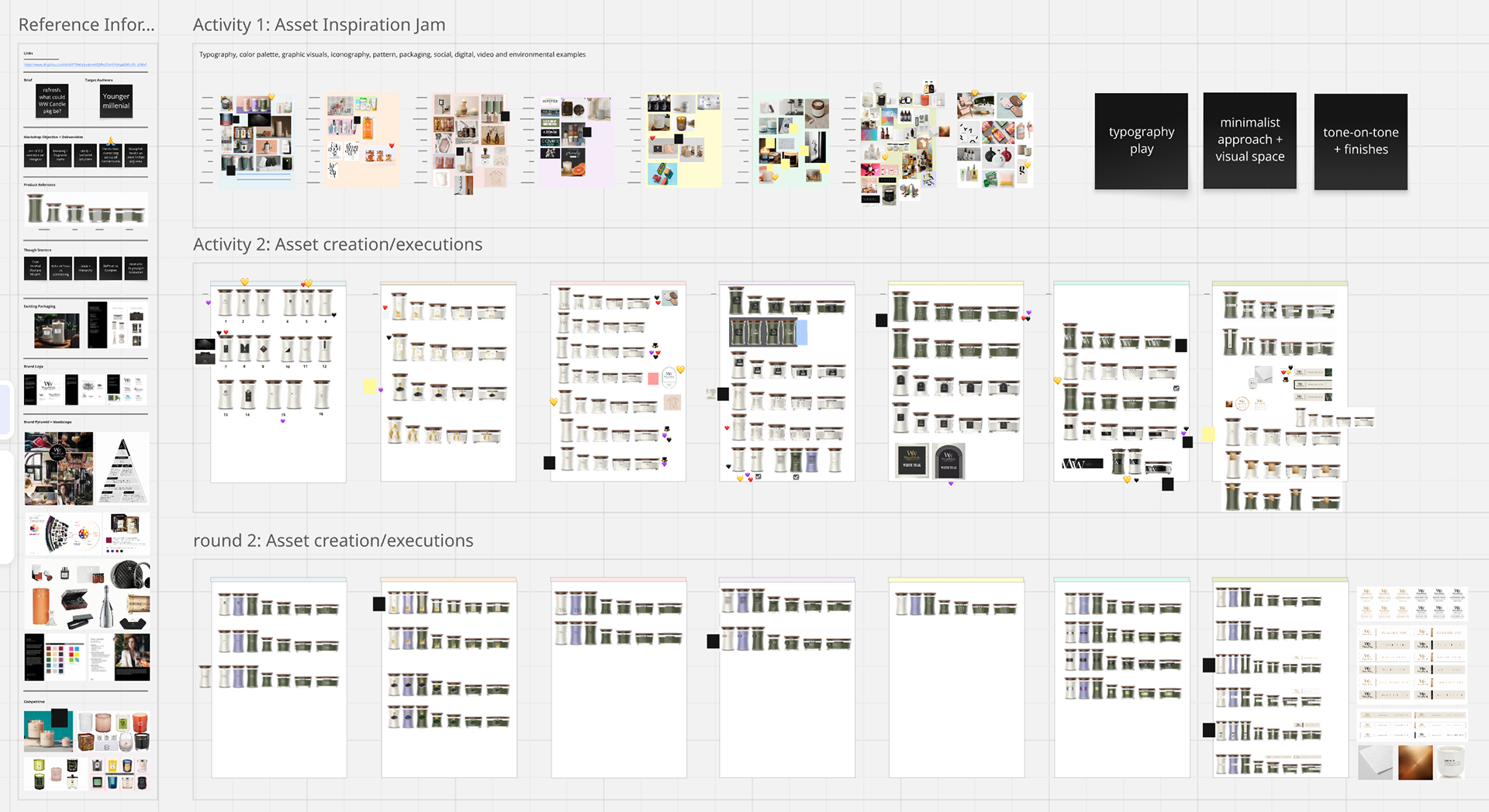
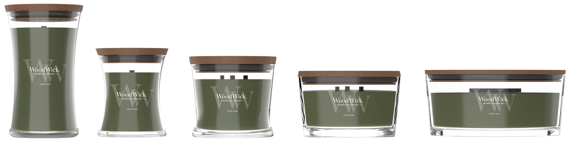
- The iconic wooden-wick hourglass vessel demands specific label proportions to clarity or distortion.
- Beneath the surface, the brand needed to honor its core identity fusing craftsmanship, elegance, and multi-sensory allure while staying consistent with packaging system limitations.
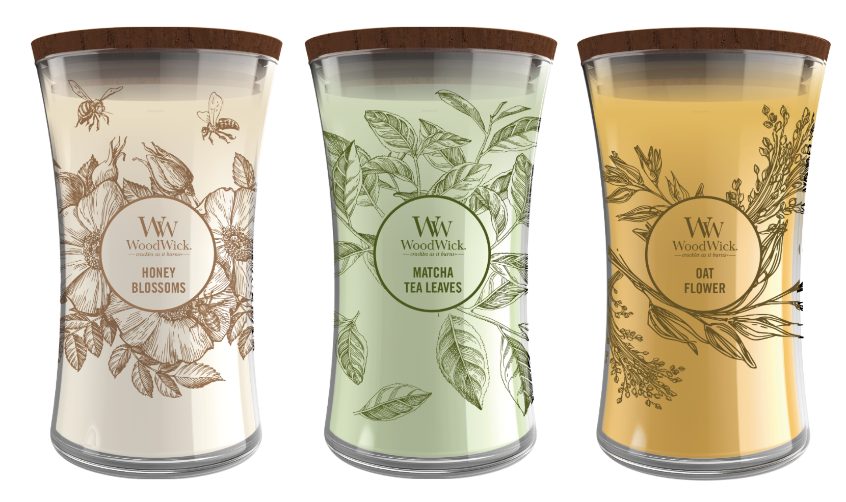
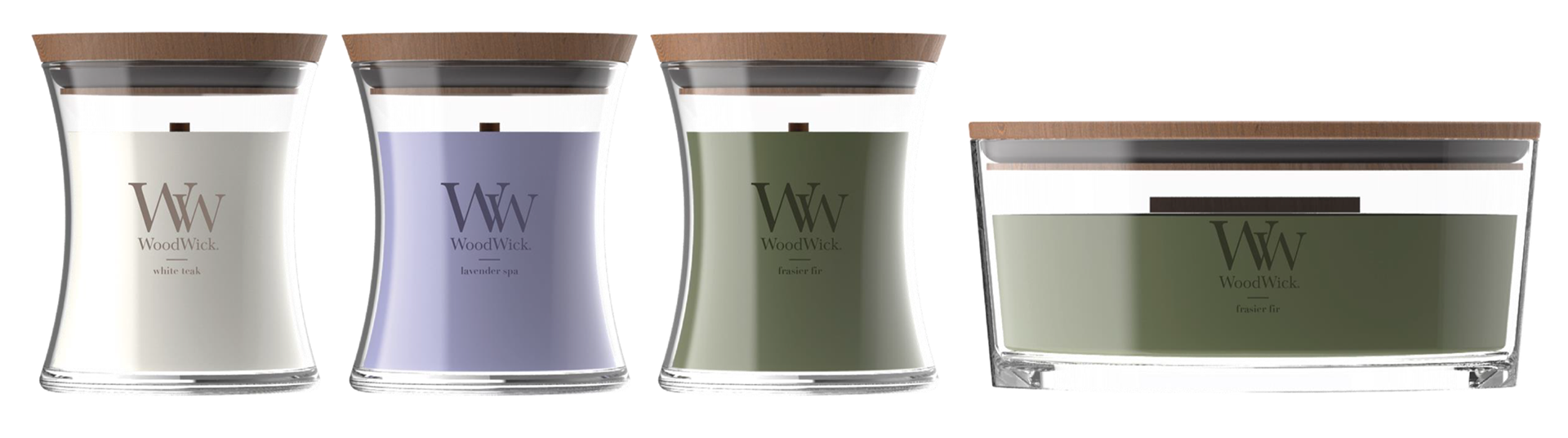
Full Wrap Exploration:
Introducing different print materials to elevate just a simple label
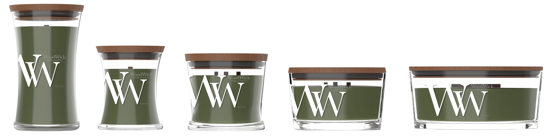
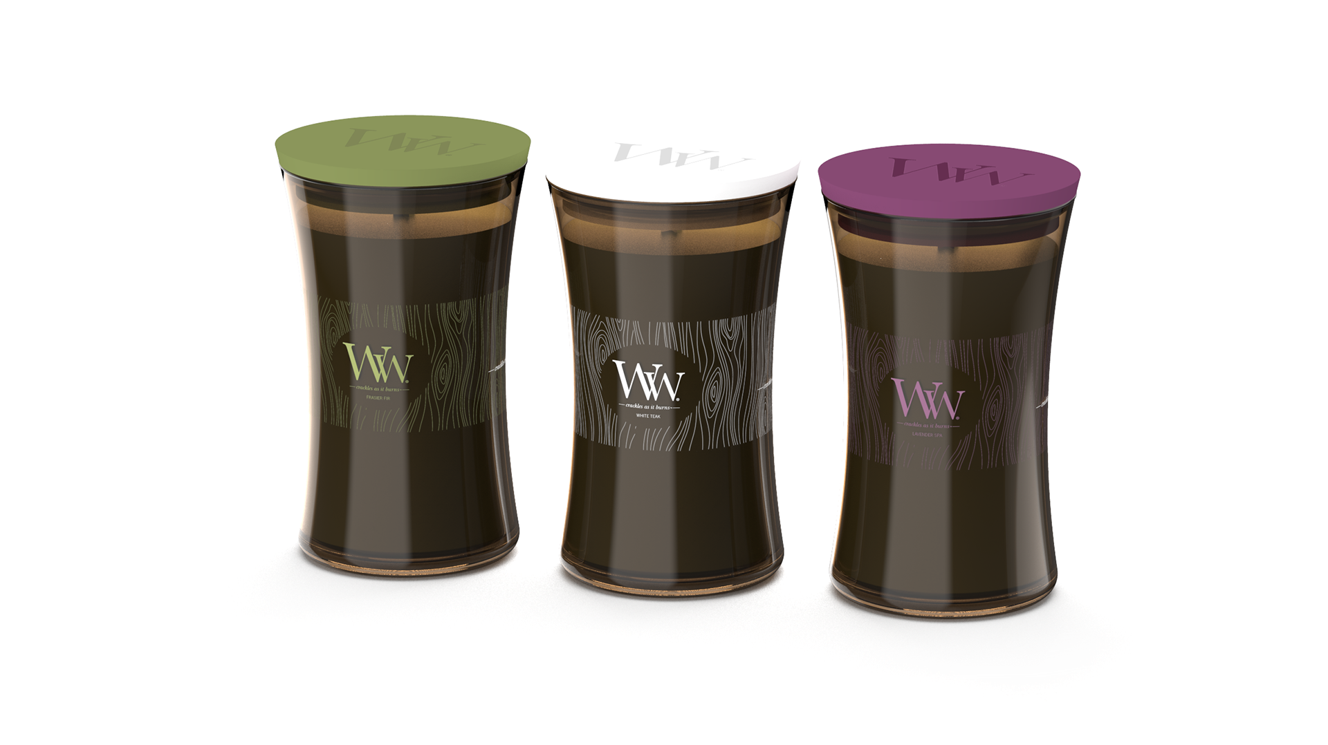
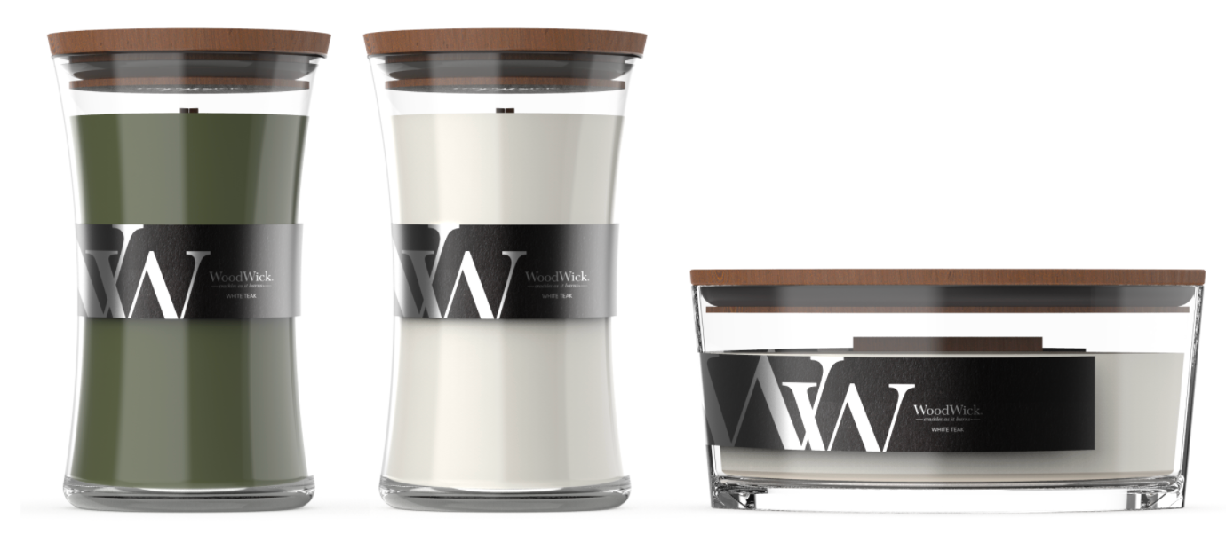
Woodwick® Label Refresh Final